OMS Account Setup Redesign
The Problem
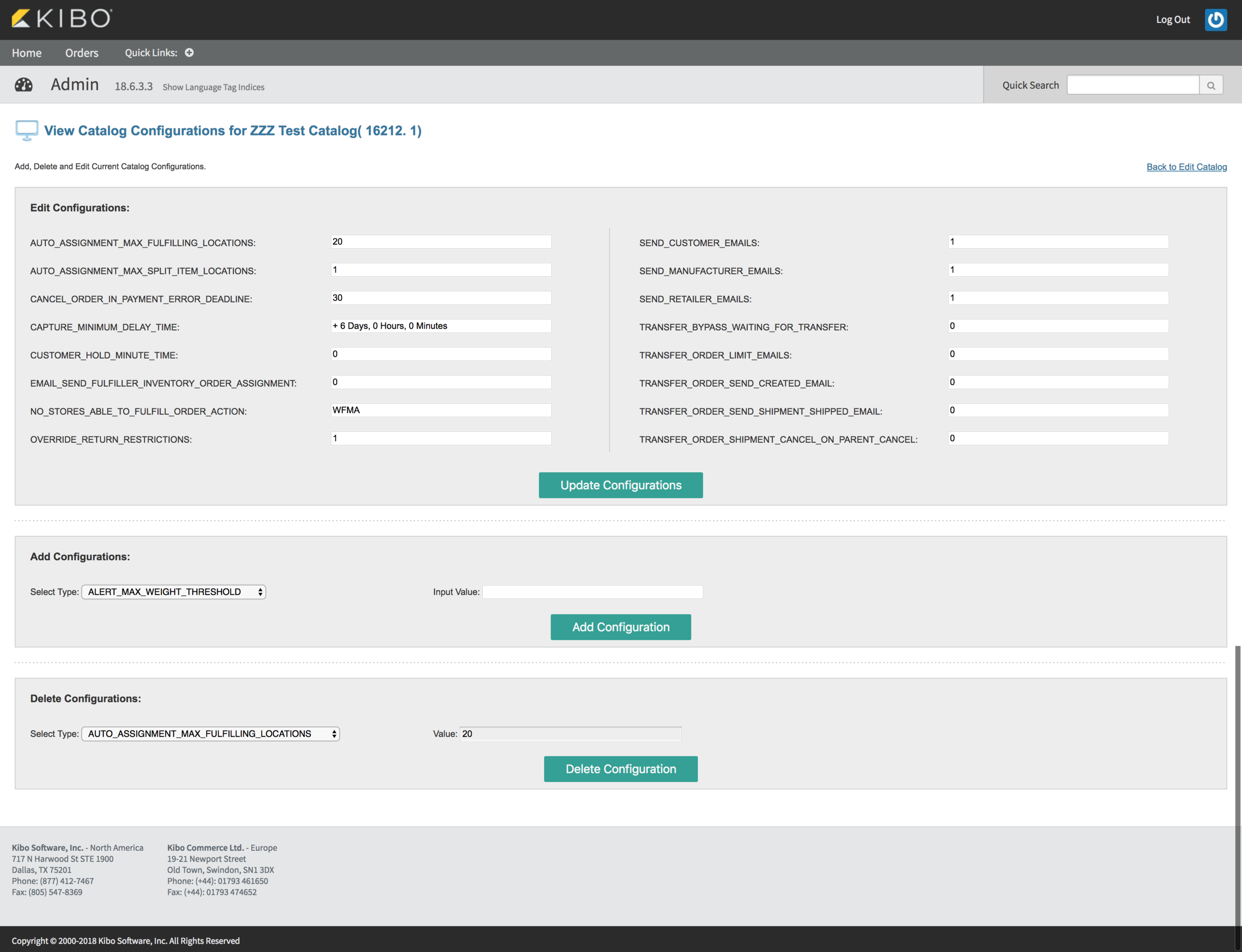
The new account setup process has been a sore point for many Kibo employees and customers. The old setup process consisted of a bunch of incongruent legacy interfaces which had not been updated since creation. The functionality of these pages was so confusing that only a few Project Managers (some who had left the company) were the only people that knew all the ins and outs of the set up process. The entire set up would require multiple Kibo employees and take days Revamping this set up process and opening it up to third party partners was a roadmap item for the company and Product department. I was tasked to redesign the new account set up process and make it so that a user new to Kibo would be able to create an account easily.
October 2017-June 2018
Website Design
Role: UX/UI Designer
Research
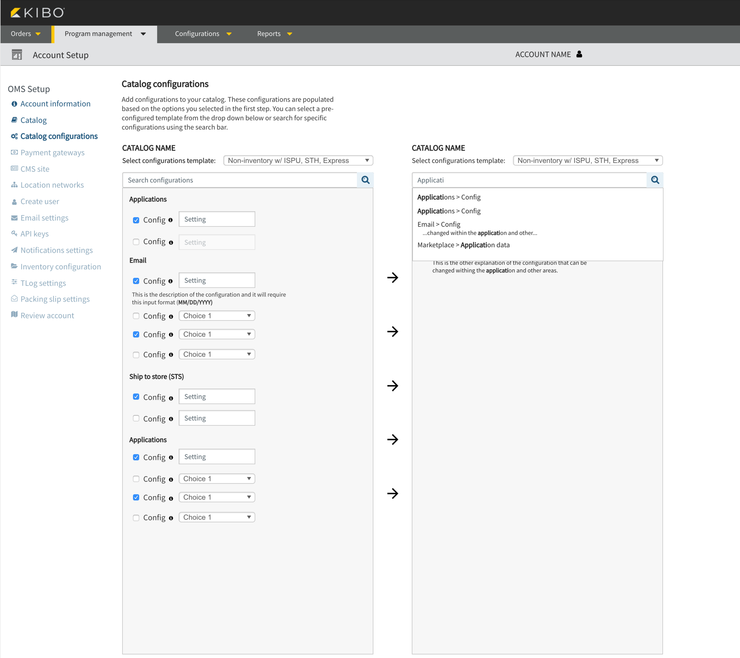
I began my research by speaking with the team that handled the implementation of new accounts. I asked this team of a project manager and technical consultants to walk me through the process of setting up a new account and point out anything they felt interfered with their ability to do their job. As they walked through the process, I made sure to take note of relevant pages and the sections within those pages that the implementation team actually used. A major issue with the current design is that the interfaces were bloated with information that either was not necessary or antiquated. It was the responsibility of the implementation team to find the relevant fields and make sure they were completed for the client.


After the (long) sessions with the implementation team, I decided to map out the existing interfaces and organize them into a flow that would make sense to someone new to Kibo.
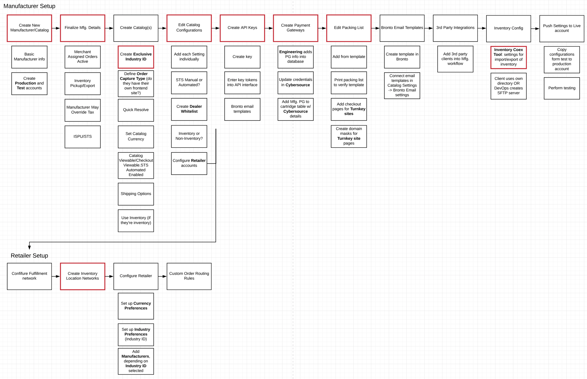
I chose to organize the interfaces by the sections which the implementation team called out as important to the process. There were other areas which were “optional” in the process, and I chose to focus on the steps that would be absolutely necessary in order to proceed. I organized these areas into contextually relevant groups where the functionalities would be achieving the same end goal for that step.
Decisions
After interviewing the implementation team, I met with the resident expert on the entire Order Management System, Nelson, who also happened to be my boss. Nelson is a longtime employee of Kibo and knows the system better than anyone. I met with him to go over my findings from the interviews and plot the next steps of the redesign. Nelson filled in the gaps of my interface map by providing context to each screen and explaining their underlying functionality and purpose. The final decision made was to design a setup flow that would provision the new user to set up a provisional account that could begin taking orders. After finishing the initial setup, the user could then go to a centralized dashboard and edit more complicated functionality. Separating the creation and configuration of the account would alleviate the overwhelming nature of the entire process and make the entire set up more palatable for a person new to the software.
This was one of my favorite projects to work on at Kibo because it allowed me to speak with a variety of stakeholders and sort through the different perspectives that go into setting up a new client with their Order Management account. I had to consider the frustrations of the implementation team as well as the business goals the Product team wanted to accomplish with the new setup process, and to balance those two aspects in my research and design was a unique challenge that helped me grow as a designer.
I used UXPin to design these screens.